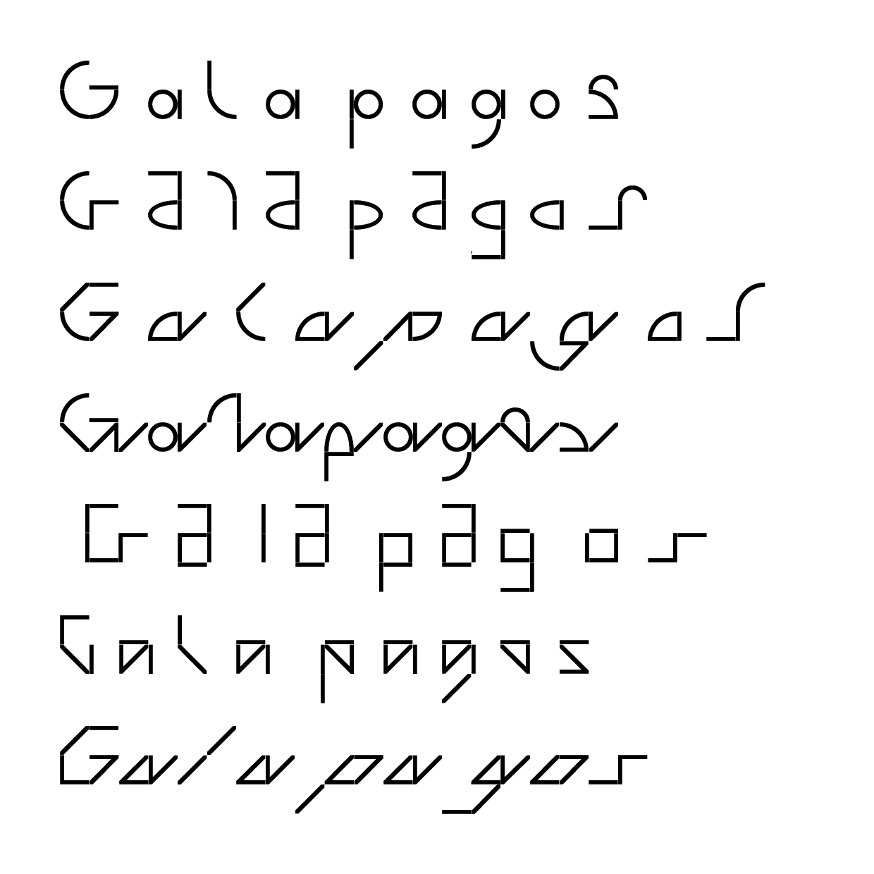
In 2017, the type foundry Dinamo created the modular typeface Galapagos, which drew inspiration from the Galapagos Game by Felix Salut. This resulted in 7 alphabets composed
of the following styles: rounded, straight, angular, and their respective crossing, with each style offering five weights and a visible grid option.
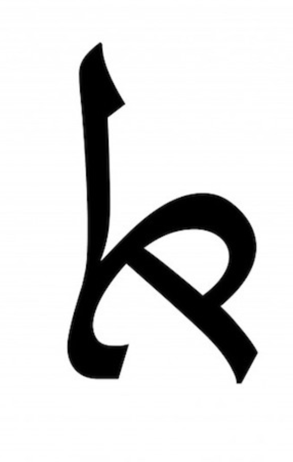
Israeli typographer Liron Lavi Turkenich created a typeface that merges Hebrew and Arabic, titled Arvarit. In Hebrew, most of
the letters’ identifying characteristics lie
in the bottom half of the letterforms, whereas the opposite is true for Arabic—creating the perfect conditions for the merging of the
two alphabets.
Conceptual artist Peter Warum of Austria
also works with language, although in the
third dimension—with Braille. He developed an inverted, or negative, form of Braille. If looked at in terms of binary, where the raised dots are considered “ones” and the remaining blanks spaces “zeros”, Warum inverted the
usual placement of these Braille dots.
Drawing on these projects for inspiration,
I want to explore and develop
adaptable, combinatorial typographical languages and systems.
One example of this could be the creation of an alphabet that mirrors the Mimosa Pudica plant, which folds in on itself when touched or shaken. Another example might be a typeface that, inspired by Warum and Turkenich, attempts to bridge Braille, American Sign Language, and traditional English—creating a multisensory experience. This exploration may also take the form of interactive websites or the creation of tangible objects, such as CDs, small books, or posters that have a paired digital component.