MuirMcNeil is the collaborative effort of typographer Paul McNeil and designer Hamish Muir. Founded in 2010, MuirMcNeil’s mission
is to focus on “exploring parametric design systems to generate appropriate solutions to visual communication problems.”
Their portfolio consists primarily of experimental typefaces they’ve developed,
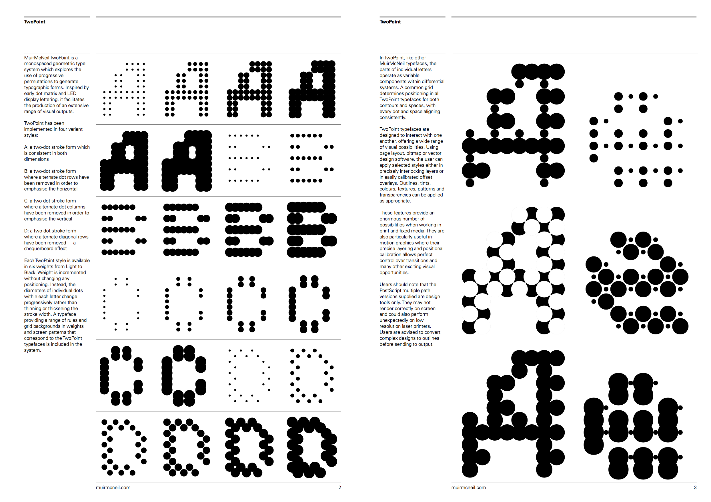
one of which is a modular typographical system named TwoPoint. TwoPoint is not just a font, it’s a monospaced, geometric, modular type system which uses continuous permutations
to generate letterforms and their respective symbols. Much like the Galapagos typeface discussed in post #1, the result is an extensive range of typographical outputs.
In creating this type system, MuirMcNeil
drew inspiration from early dot matrix and
LED display lettering.
The modular parts within individual letters operate as variable components within the different typefaces produced, with a singular grid system operating as the framework for the entire system. The typefaces generated from this system are meant to interact with one another, further facilitating the generation
of an extensive range of typographical and visual outputs.
TwoPoint includes four different
variant styles:
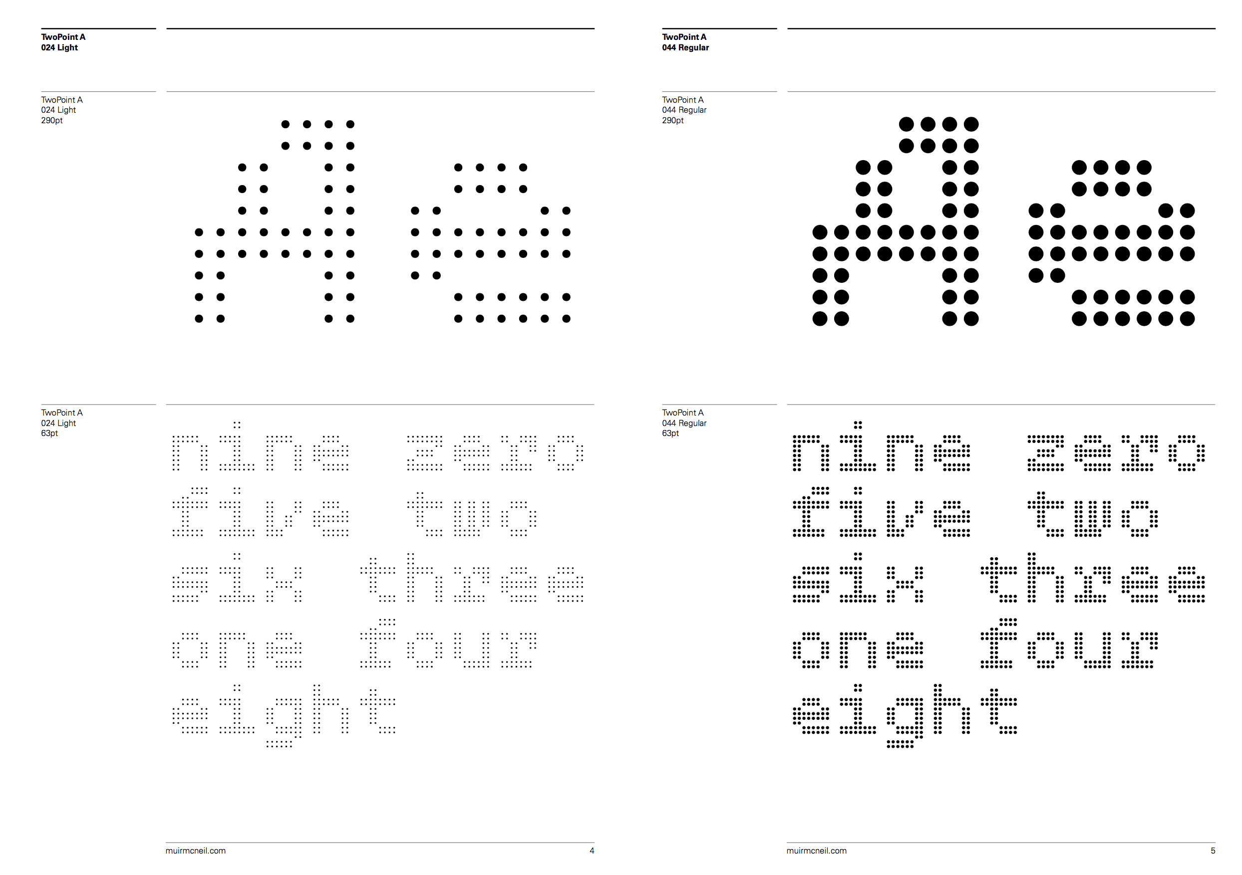
A: a two-dot stroke form which is consistent in both dimensions
B: a two-dot stroke form where alternate dot rows have been removed in order to emphasise the horizontal
C: a two-dot stroke form where alternate dot columns have been removed in order to emphasise the vertical
D: a two-dot stroke form where alternate diagonal rows have been removed — a chequerboard effect
Each of these styles is available in six different weights from light to black. Adjusting the weight only increases the diameter of each circular modules so as not
to disrupt the positioning of any module.